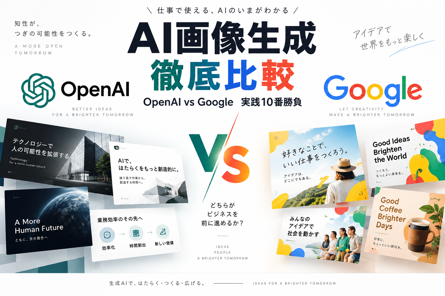
「ビジネスで実用できる画像AIといえば、デザインセンス抜群のOpenAI(ChatGPT Images 2.5)一強なのか?」「Googleの画像生成は、今回のアップデートでどこまで追いついたのか?」
2026年10月6日、Googleから数ヶ月ぶりの最新画像生成モデル「Nano Banana 2.1(Gemini 3.6 Flash基盤)」がリリースされました。これまで最大の弱点とされてきた日本語描画やレイアウト崩れが大幅に改善されたと言われています。
そこで今回、AI仕組みラボでは**「メーカーが違うだけでどちらも最新最高峰」**である2大巨頭、OpenAI「ChatGPT Images 2.5(gpt-image-2.5-sunburst)」と、Google「Nano Banana 2.1(gemini-nano-banana-2.1)」を、1文字の違いもない同一プロンプトで10パターン直接対決させました。
検証ルール:10パターンすべて、全く同じ英語・日本語プロンプトを入力し、両AIが出力したPNG画像を一切のレタッチなし・そのまま並べて比較しています。
第1章:ビジネス図解の対決
提案資料や社内マニュアル、ブログ記事で最も需要が高い「業務ステップ」と「前後比較」の図解です。
勝負01|業務改善の3ステップ(フロー図解)
16:9 横長スライド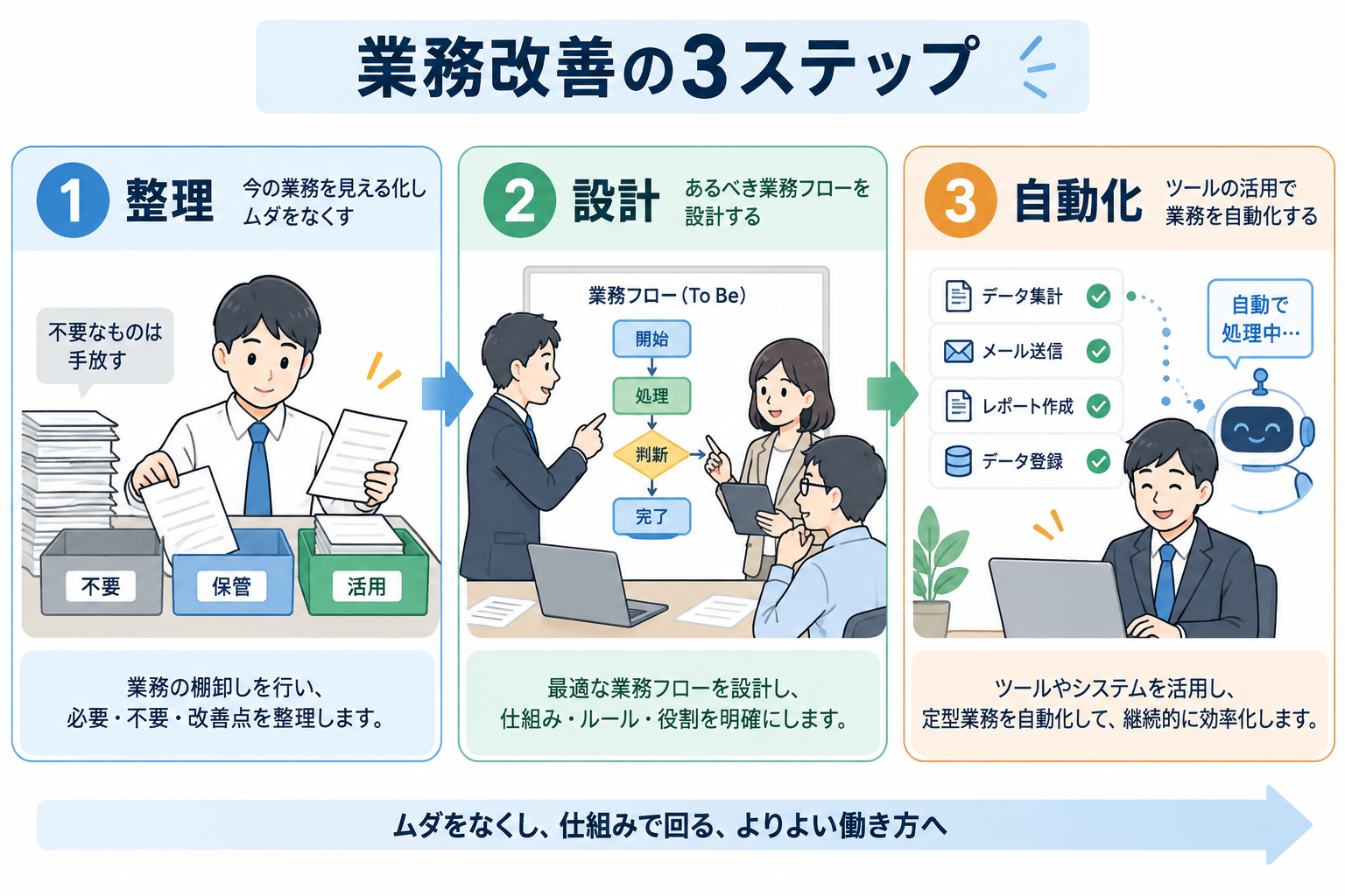
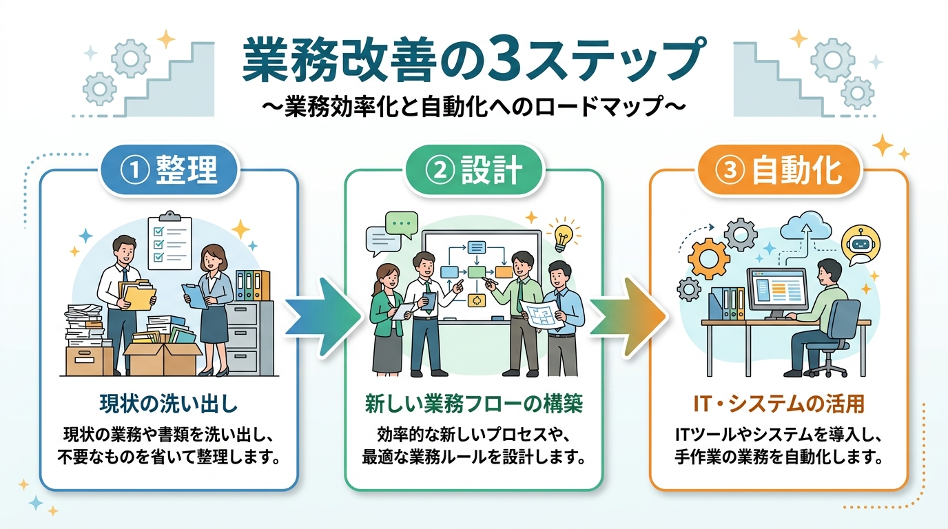
使用した共通プロンプトを表示
A Japanese business infographic slide. Clean white background. Neat Japanese title '業務改善の3ステップ' at the top banner. 3-step flowchart layout: Step 1 labeled '① 整理' showing sorting documents, Step 2 labeled '② 設計' showing team building a workflow blueprint, Step 3 labeled '③ 自動化' showing tasks running automatically on computers. Friendly Japanese business illustration aesthetic, clear connecting arrows, legible Japanese text labels, 16:9 widescreen.
勝負02|手作業 vs 自動化(ビフォーアフター比較図解)
16:9 横長スライド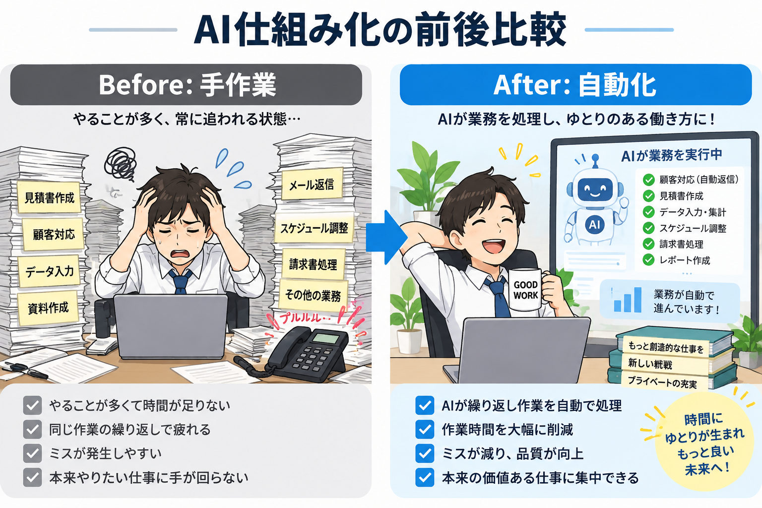
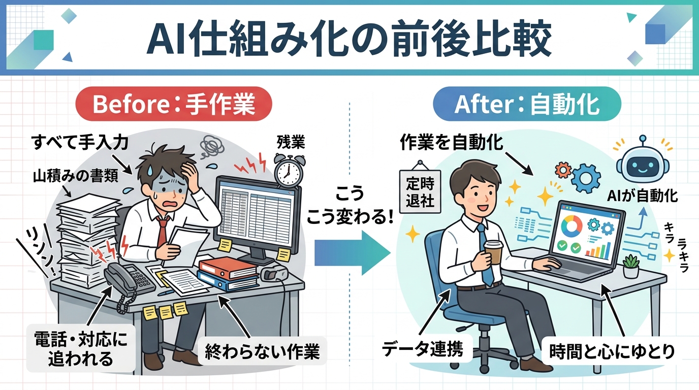
使用した共通プロンプトを表示
A Japanese business infographic slide comparing Before and After. Clean white background. Neat Japanese title 'AI仕組み化の前後比較' at top banner. Side-by-side comparison: Left side labeled 'Before: 手作業' showing an overwhelmed worker buried under paper stacks and ringing phones. Right side labeled 'After: 自動化' showing the same worker relaxed and smiling with coffee while an AI dashboard manages tasks. Friendly Japanese illustration style, legible Japanese text, 16:9 widescreen.
第2章:店舗で使えるPOP対決
飲食店やサロンの店頭・卓上に置くPOPは、シズル感や清潔感だけでなく「メニュー名と価格が正確に読めること」が絶対条件です。
勝負03|カフェの特製スパイスカレー(卓上POP)
1:1 スクエア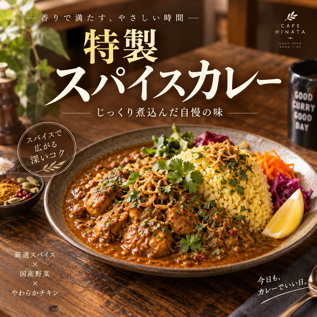
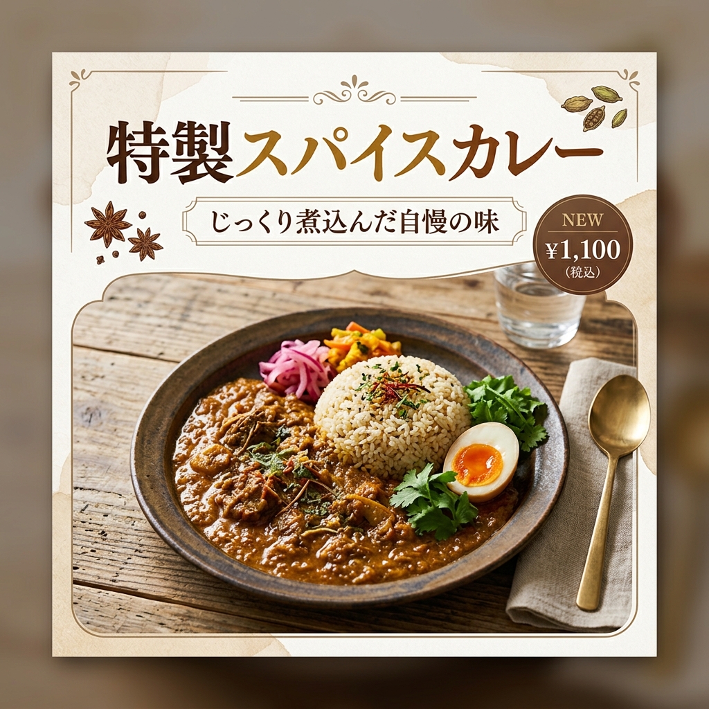
使用した共通プロンプトを表示
A stylish Japanese cafe tabletop POP design. Clean appetizing aesthetic. Bold elegant Japanese title '特製スパイスカレー' prominently displayed. Subtitle text 'じっくり煮込んだ自慢の味'. A delicious mouthwatering plate of aromatic spice curry with fragrant rice and fresh herbs, warm cafe lighting, rustic wooden table background, warm colors, professional graphic design layout, 1:1 square ratio.
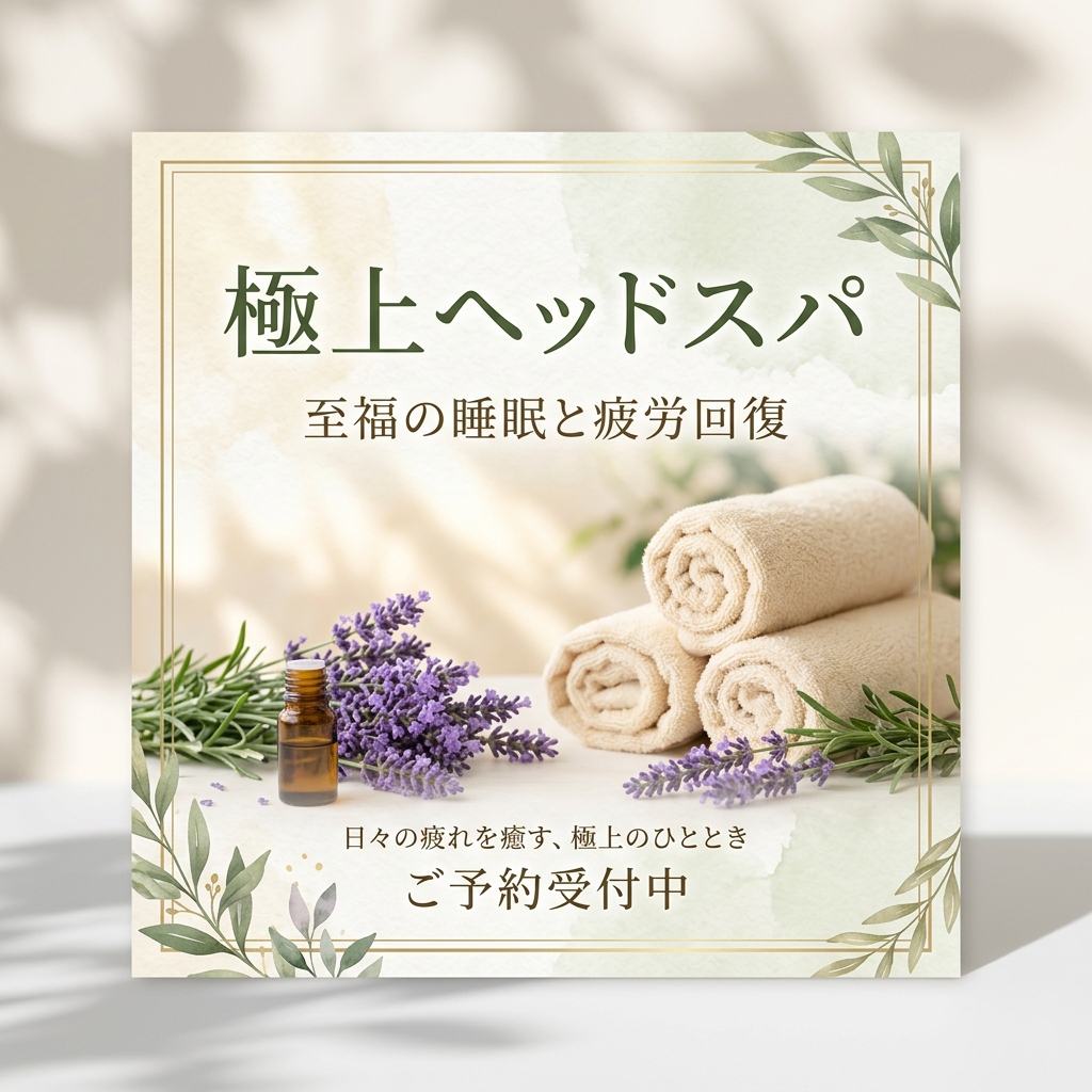
勝負04|リラクゼーションサロンの極上ヘッドスパ(卓上POP)
1:1 スクエア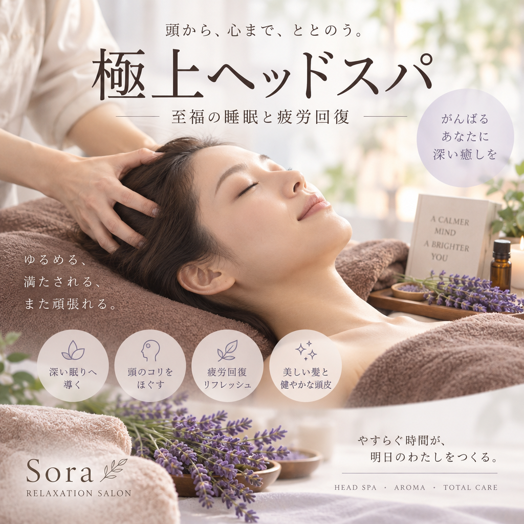
使用した共通プロンプトを表示
A serene Japanese relaxation salon tabletop POP design. Clean calming aesthetic. Elegant Japanese title '極上ヘッドスパ'. Subtitle '至福の睡眠と疲労回復'. Peaceful aesthetic with gentle pastel tones, warm towels, aromatic lavender herbs, soft natural lighting, elegant Japanese typography and beauty salon flyer layout, 1:1 square ratio.
第3章:イベントチラシ・ポスター対決
縦長のチラシ(9:16)は、タイトル・日時・場所・タイムスケジュール・申し込み方法など「情報量の多さ」が求められる最難関ジャンルです。
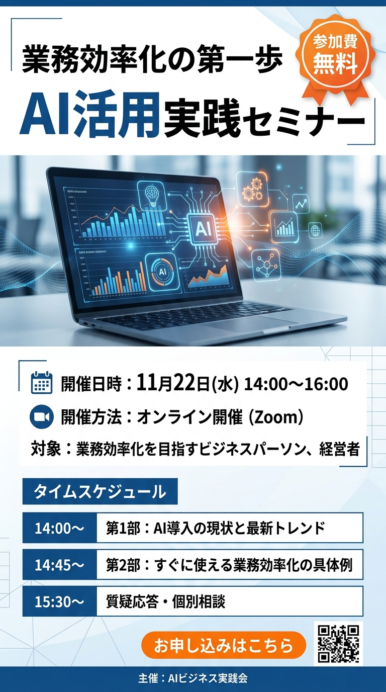
勝負05|ビジネスセミナー案内チラシ
9:16 縦長フライヤー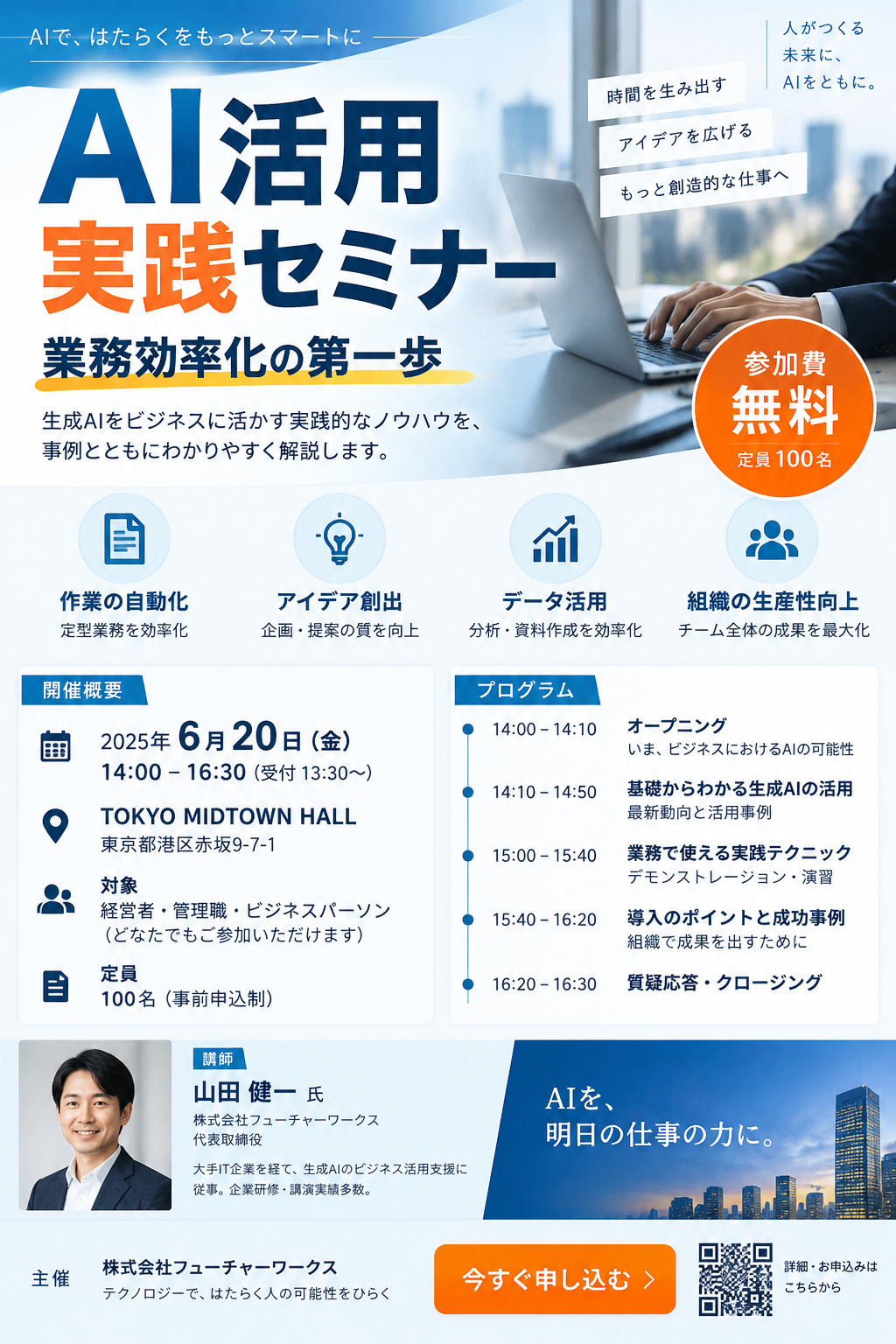
使用した共通プロンプトを表示
A modern Japanese business seminar flyer poster. Vertical layout. Clear prominent Japanese headline 'AI活用実践セミナー' at the top. Catchphrase '業務効率化の第一歩' and badge labeled '参加費 無料'. Professional layout with laptop, modern icons, structured schedule boxes, clean trustworthy blue and orange corporate design, crisp legible Japanese text, 9:16 vertical aspect ratio.
勝負06|週末クラフトマルシェ案内ポスター
9:16 縦長フライヤー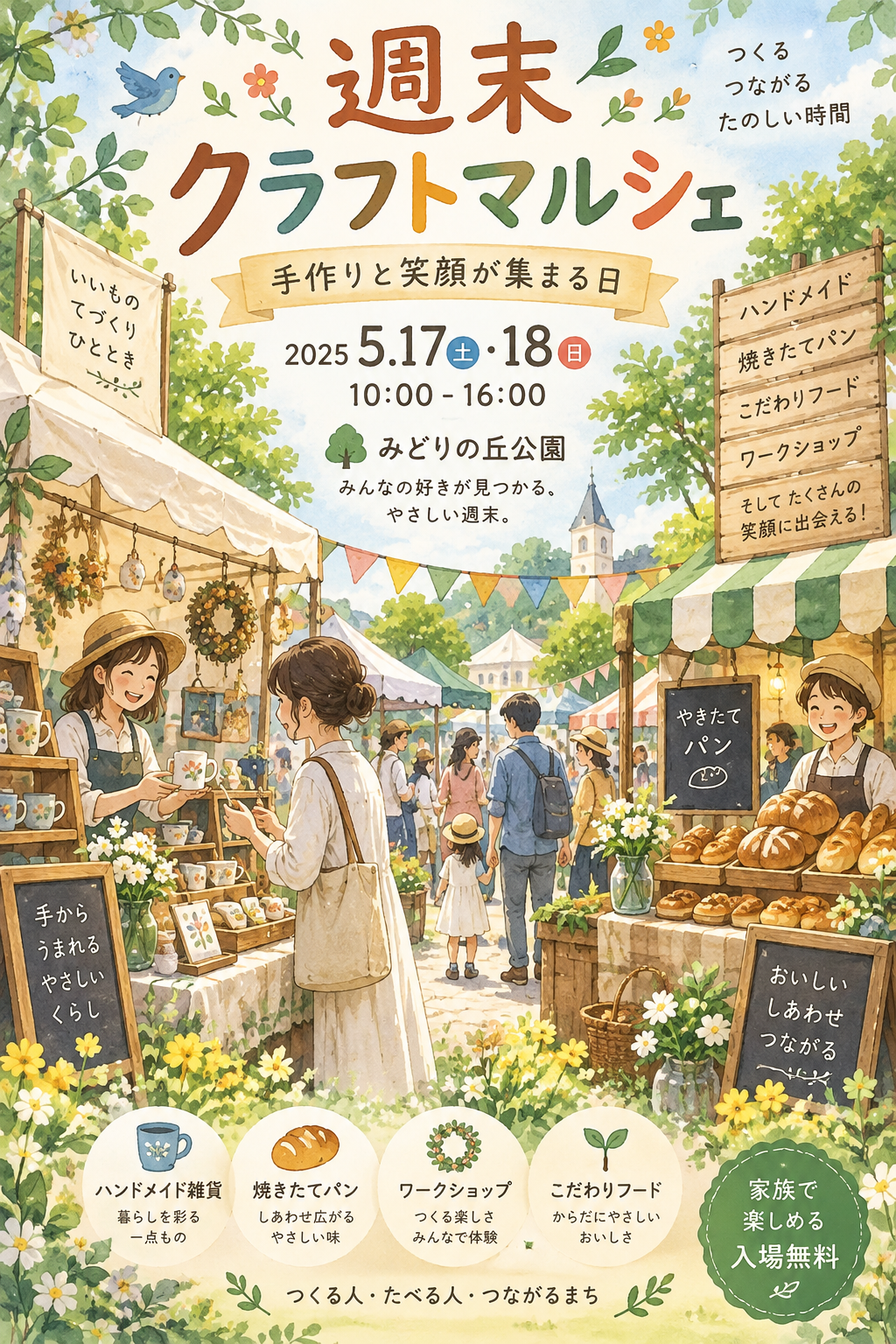
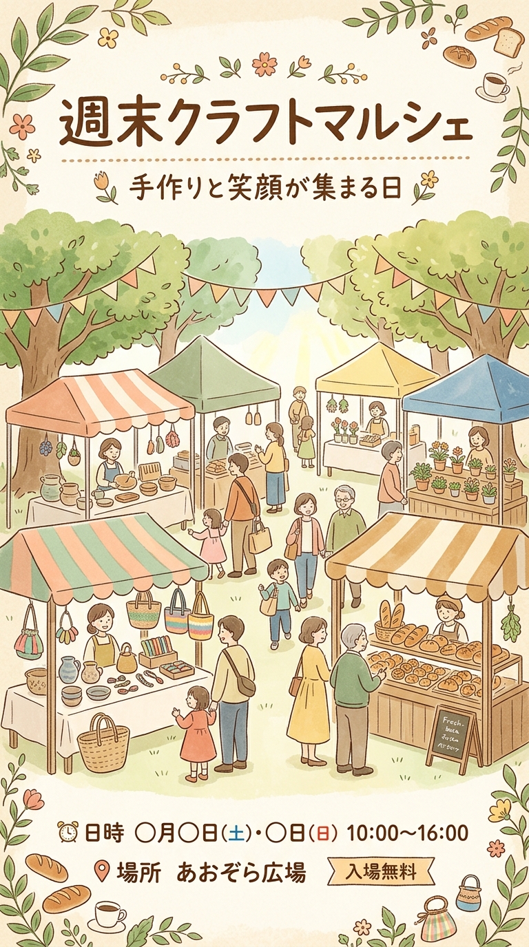
使用した共通プロンプトを表示
A charming Japanese community weekend market event flyer poster. Vertical layout. Warm hand-drawn Japanese title '週末クラフトマルシェ' at top. Sub-headline '手作りと笑顔が集まる日'. Cheerful illustrations of artisan handmade crafts, fresh baked bread, colorful stalls under awnings, happy visitors, warm botanical pastel aesthetic, crisp legible Japanese text, 9:16 vertical aspect ratio.
第4章:Webバナー・SNS広告対決
Webマーケティングで最もクリック率(CTR)を左右するバナー広告。視線誘導と「CTA(行動喚起ボタン)」の表現力を比較します。
勝負07|AI導入支援のWebヘッダーバナー
16:9 横長バナー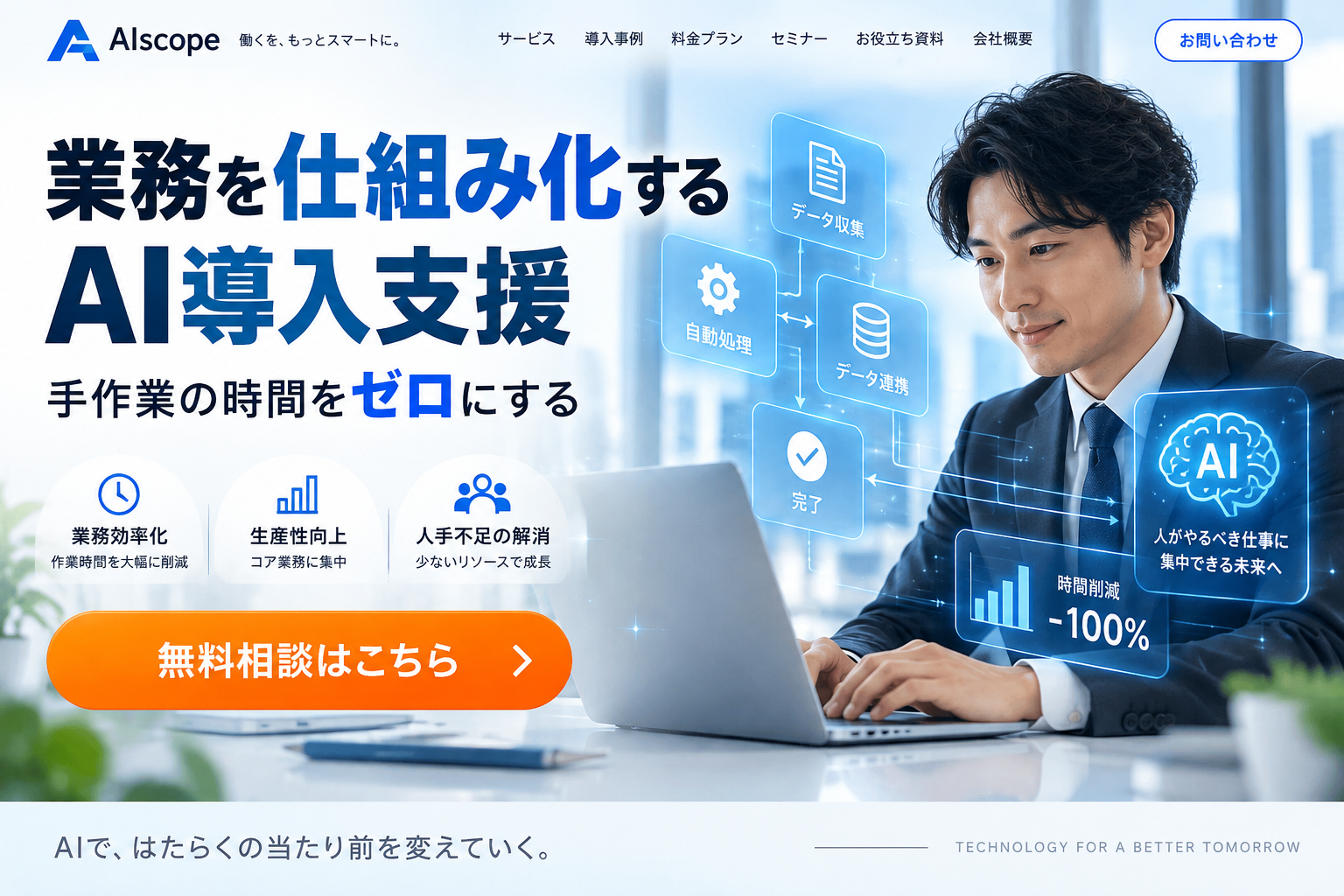
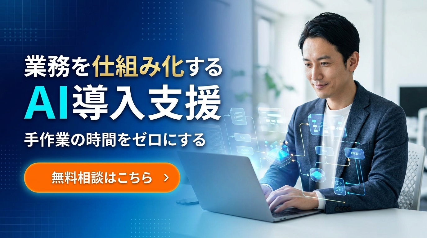
使用した共通プロンプトを表示
A high-converting Japanese business website header banner. Modern sleek design. Bold legible Japanese text '業務を仕組み化するAI導入支援'. Subtext '手作業の時間をゼロにする'. A prominent orange call-to-action button labeled '無料相談はこちら'. A confident Japanese professional working on a laptop with holographic digital workflow graphics, clean modern white and blue aesthetic, 16:9 widescreen banner.
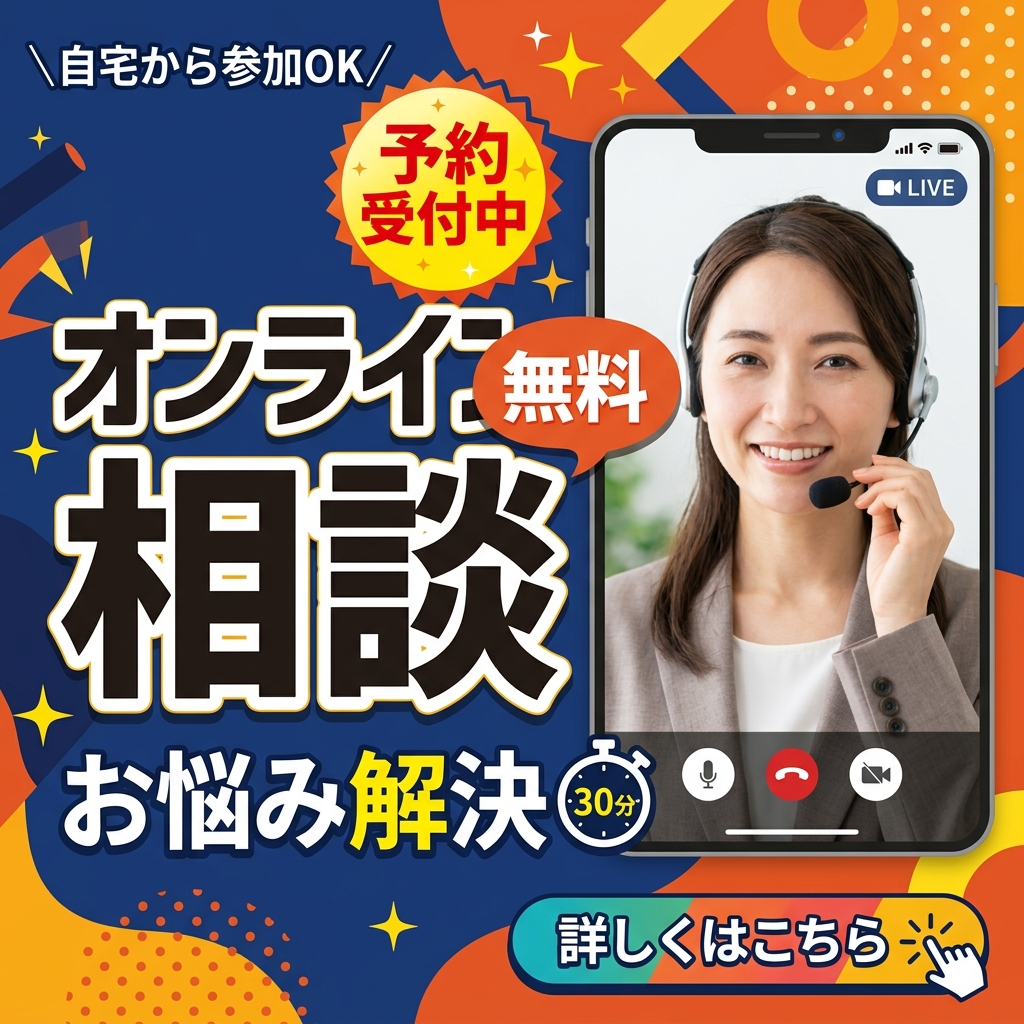
勝負08|オンライン相談のSNS広告スクエアバナー
1:1 スクエア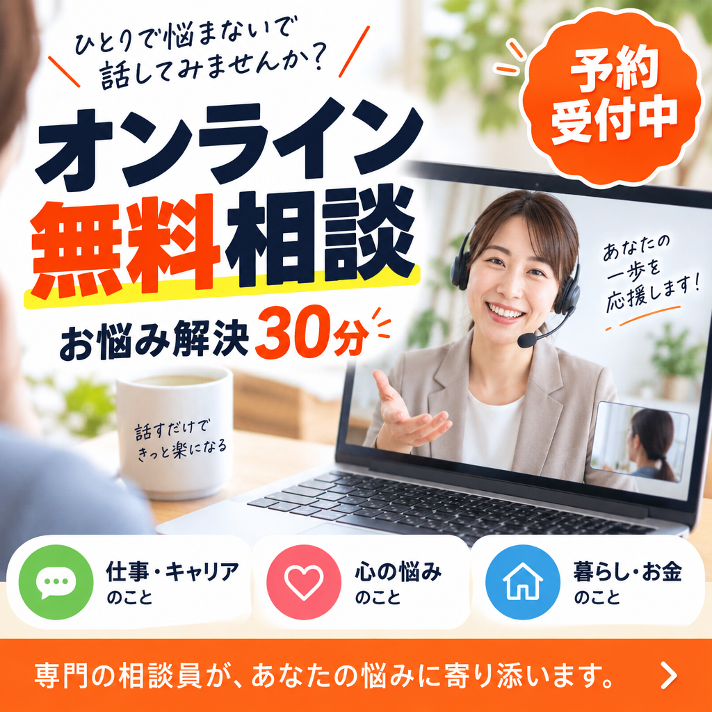
使用した共通プロンプトを表示
An eye-catching Japanese social media advertising square banner. High contrast modern design. Bold clear Japanese text 'オンライン無料相談'. Subtext 'お悩み解決30分'. Badge with '予約受付中'. Warm approachable smiling consultant on video call screen, friendly colors, clean typography, engaging social ad layout, 1:1 square ratio.
第5章:ホームページデザイン(カンプ)対決
Webサイト制作の初期段階でクライアントとイメージを擦り合わせる「ファーストビューカンプ」です。
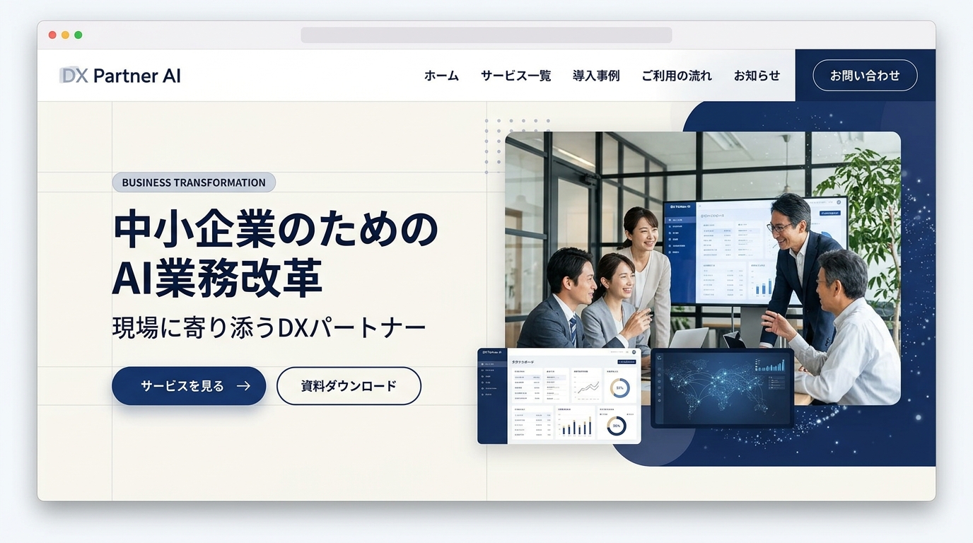
勝負09|コーポレートDXパートナーのLPカンプ
16:9 横長LPモックアップ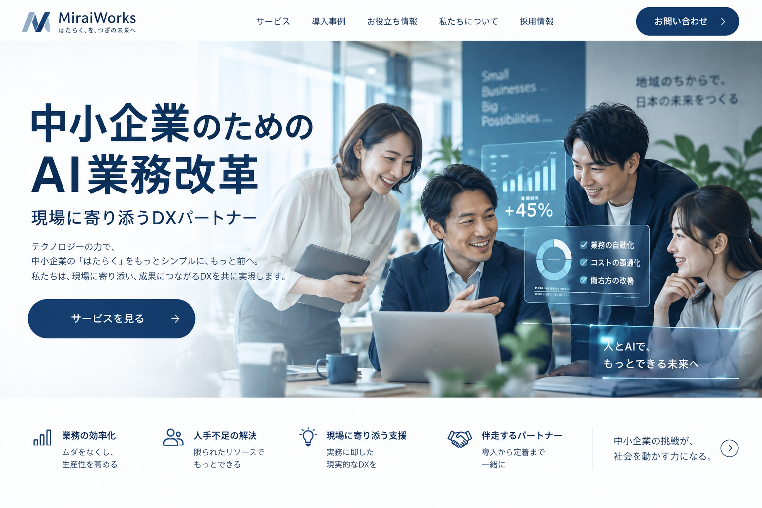
使用した共通プロンプトを表示
A modern Japanese corporate landing page hero section concept mockup. Professional website layout with top navigation bar. Large clean Japanese hero typography '中小企業のためのAI業務改革'. Subheading '現場に寄り添うDXパートナー'. Primary CTA button labeled 'サービスを見る'. Elegant photo illustration of an office team collaborating with smart digital dashboards, trustworthy navy blue and warm white tones, 16:9 widescreen composition.
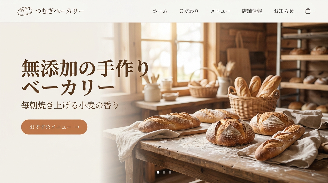
勝負10|無添加手作りベーカリーのLPカンプ
16:9 横長LPモックアップ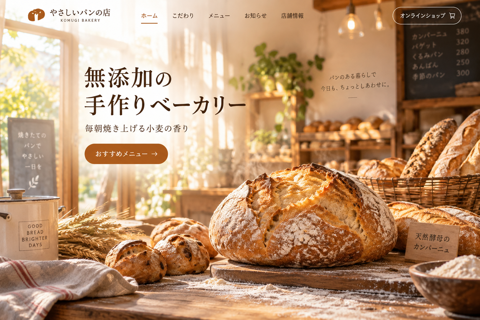
使用した共通プロンプトを表示
A warm charming Japanese bakery website landing page hero section concept mockup. Header navigation at top. Large warm Japanese hero typography '無添加の手作りベーカリー'. Subtitle '毎朝焼き上げる小麦の香り'. Button labeled 'おすすめメニュー'. Beautiful artisanal crusty bread, rustic flour-dusted table, sunlight streaming into cozy cafe bakery, natural warm aesthetic, 16:9 widescreen composition.
まとめ:ビジネス現場での実践的な使い分け
今回の同一プロンプト10番勝負を通じて、両モデルの「個性と強み」がはっきりと見えてきました。
1. デザインセンスの王者:OpenAI(ChatGPT Images 2.5)
タイポグラフィ(文字フォントの選び方)、全体のレイアウト、写真のシズル感やライティングの洗練度において、依然としてOpenAIは圧倒的なデザインセンスを誇っています。「本格的なチラシ」「勝負プレゼン資料」「洗練されたWebバナーやLP」など、クオリティを最優先したい場面では、OpenAIが第一の選択肢になります。
2. 脅威の追い上げを見せる新鋭:Google(Nano Banana 2.1)
一方で、GoogleのNano Banana 2.1の進化も目覚ましいものがあります。数ヶ月前まで弱点だった「文字化け」や「アスペクト比の崩れ」が完全に解消され、OpenAIの背中がはっきりと見える実用レベルに到達しました。手書きマンガ調の図解、アットホームな地域イベント、社内向けの分かりやすい資料作成では、Nano Banana 2.1の温かいトーンが大きな強みを発揮します。
3. シーン別の使い分けガイド
- OpenAIを選ぶべきシーン:法人向け提案書、高級感を出したい店舗POP、広告バナー、洗練されたWebカンプ
- Googleを選ぶべきシーン:手書きマンガ風図解、社内マニュアル、地域マルシェ、コストを抑えて大量にABテストを行いたい場合
自社の発信や販促物を、AIで仕組み化しませんか?
AI仕組みラボでは、チラシ・バナー・議事録図解・業務マニュアルの自動化など、日々の仕事を軽くするAI活用法を実践サポートしています。
無料5ステップ講座で仕組み化を体験するAI仕組みラボ セミナー
AIを、あなたの商売で。
Codexの実画面で、企画・発信づくりを紹介します。自分の商売で、何を試すか。一緒に考える約60分です。
開催日は、順次追加しています。最新の日程は、申込ページでご確認ください。
最新日程を確認して申し込む →Zoom・約60分。参加費3,300円(税込)。公式LINEの友だちは無料です。セミナー参加費とラボの月額会費は別です。